Tracking is a page away.
The home page has no tracking field. "Track & Trace" is a button under the banner, and it opens another page.
A concept redesign of J&T Express Philippines' home page, built around one action: finding your parcel. Not a paid project, and not affiliated with J&T Express.
Concept redesign · Delivery · Philippines · Design and build
Visit the live site (opens in a new tab)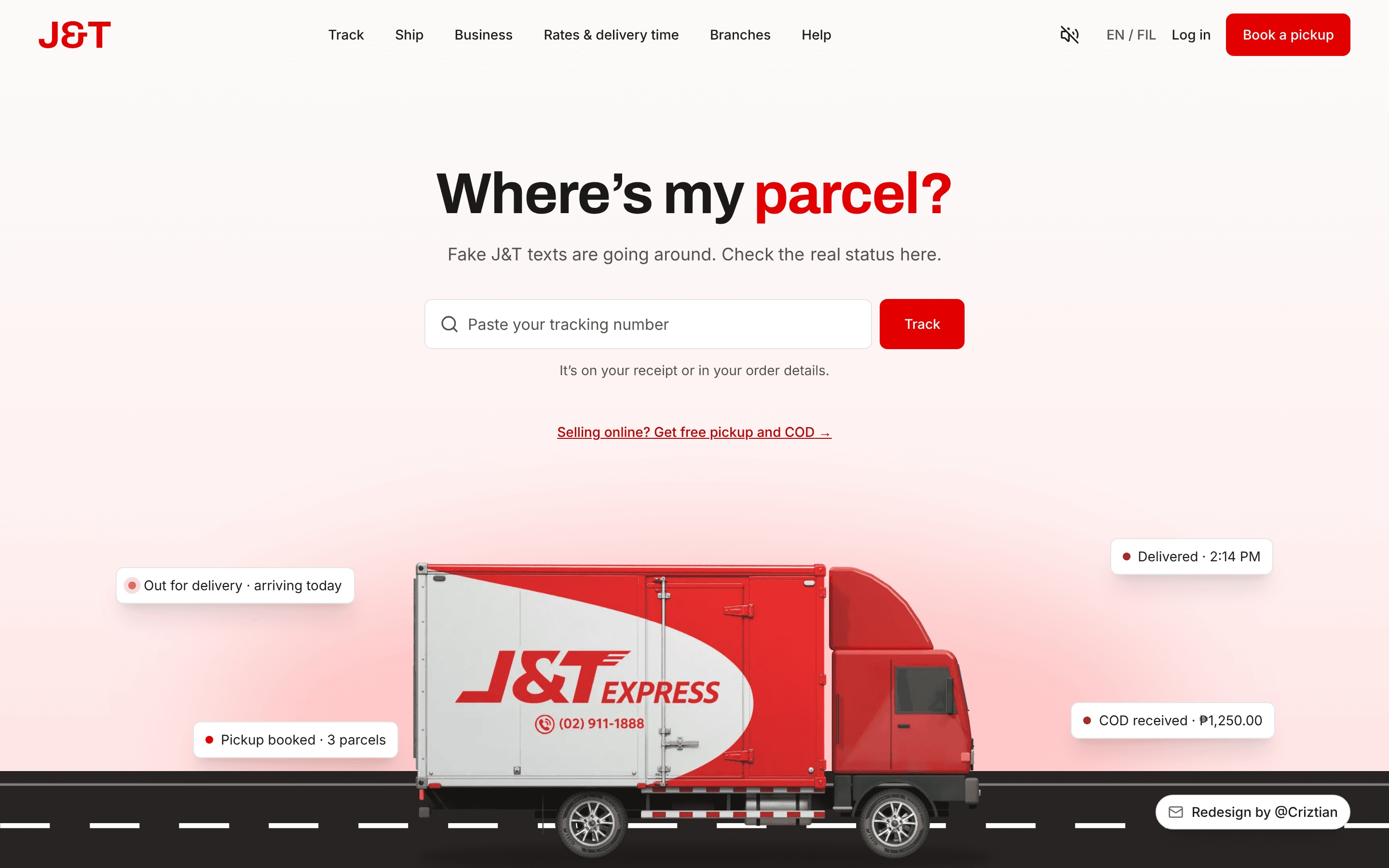
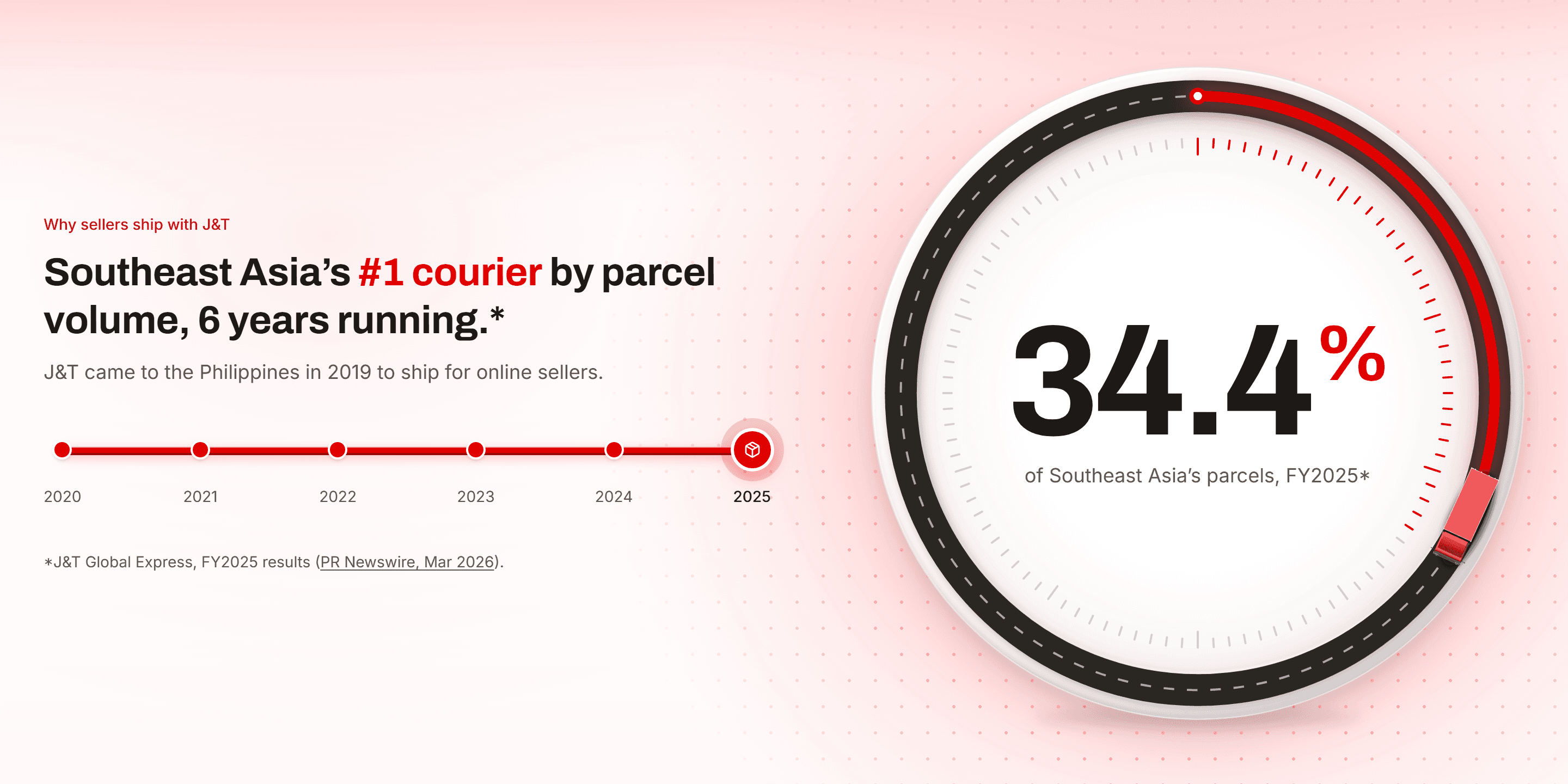
J&T Express has delivered parcels in the Philippines since 2019, with free door-to-door pickup, cash on delivery and service every day of the year. Its parent group is Southeast Asia's #1 courier by parcel volume, six years running.
The goal I set: anyone with a tracking number finds their parcel in one step, and small online sellers see why to ship with J&T. The current home page doesn't make either easy.
Their home page has a lot to carry. Here's what I'd change.
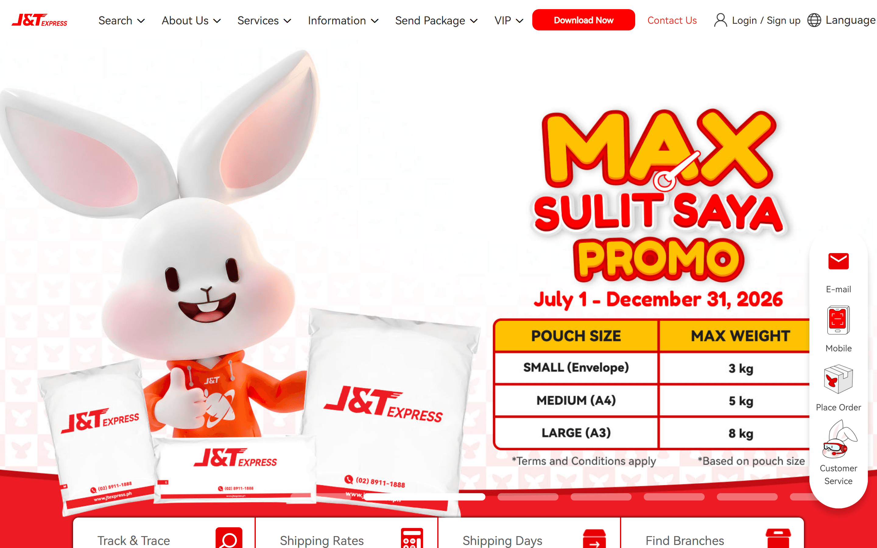
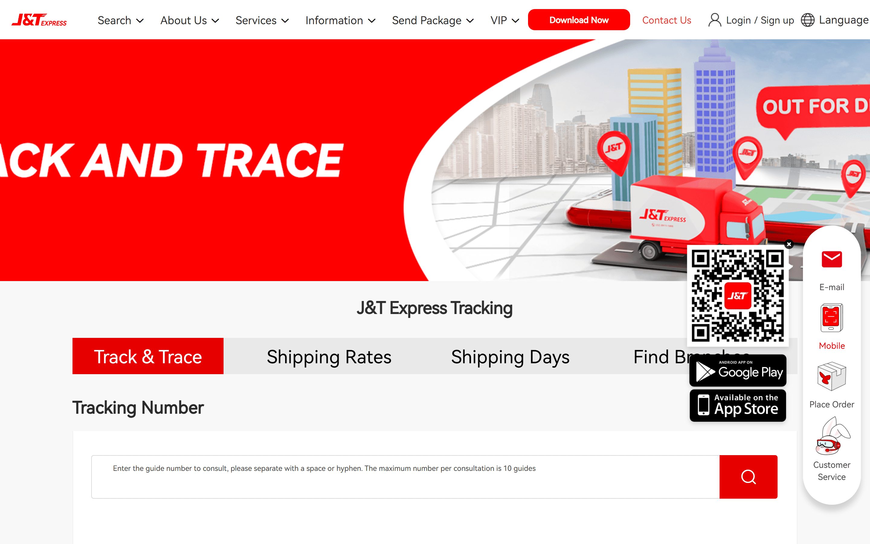
The home page has no tracking field. "Track & Trace" is a button under the banner, and it opens another page.
Free pickup appears once, inside a long paragraph. COD gets one of 7 rotating banners and a blog title. Neither is listed under Our Services.
The page never says J&T is Southeast Asia's #1 courier. It ends on partner logos and award badges instead.
Each change answers one of the notes above.
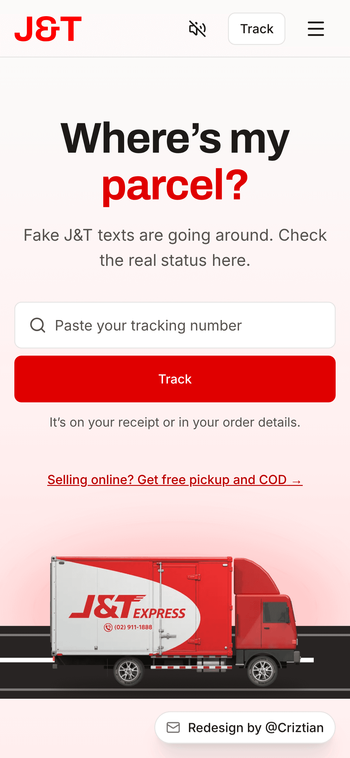
Before, you clicked through to another page. Now the field comes first: "Where's my parcel?", paste the number, press Track. The site's top searches are tracking terms (Ahrefs estimate). It's a concept, so tracking isn't live yet.
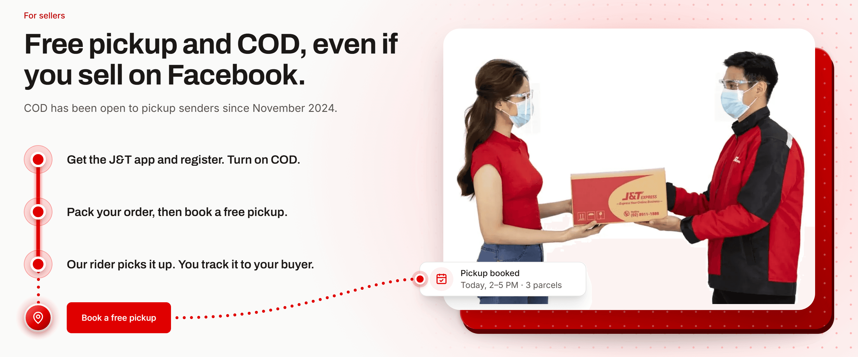
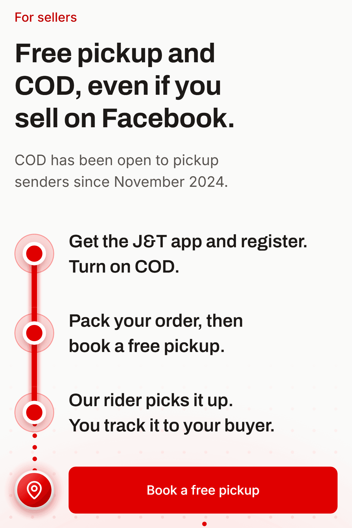
Before, sellers had to hunt for them. Now a link on the first screen leads to a section with 3 steps and one button: Book a free pickup.
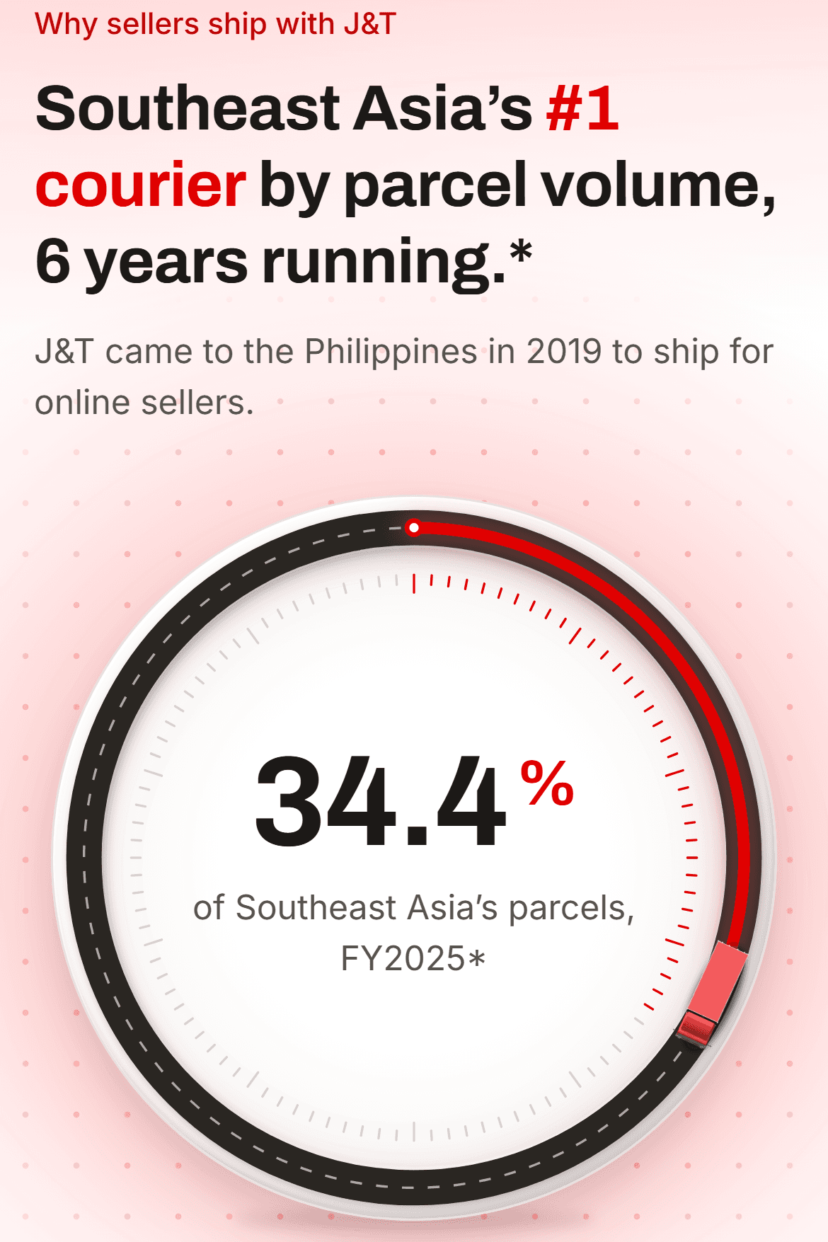
Before, the #1 rank wasn't on the page. Now it leads its own section with the 34.4% share, linked to J&T's FY2025 results, with the awards and partner logos under it. A 3D truck I rendered in Blender carries one parcel's trip down the page. The name, logo and red stay.
It's a concept, so there are no results yet. If it went live, I'd track these 3 things.